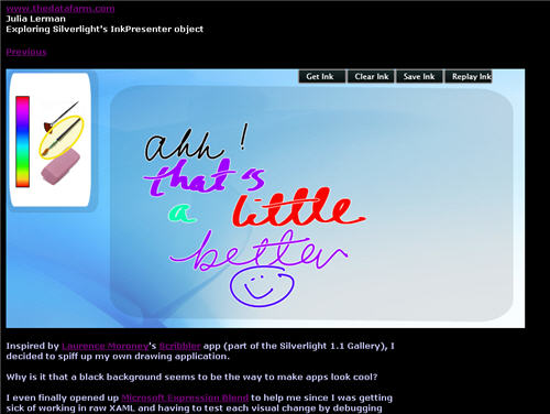
Inspired by the Scribbler app (part of the Silverlight 1.1 Gallery), written by Daniel Cook & Pete Blois (with some inspiration from Laurence Moroney) I decided to spiff up my own drawing application.
Why is it that a black background seems to be the way to make apps look cool?
I even finally opened up Microsoft Expression Blend to help me since I was getting sick of working in raw XAML and having to test each visual change by debugging the app. Last time I looked at this product, it frightened me and I closed it quickly. But now that I have done enough of the hand-coded XAML, it was not a huge leap to comprehend how to use Expression Blend and what I could do with it.
One thing that I discovered is that the Background property of the InkPresenter element, while necessary, is not recognized by the designer. So to do the design in Expression, I had to remove that property, then replace it when I wanted to test out the app.
Since my app is still using the v1.0 of Silverlight (and javascript, not .NET), I can’t pull off the slick color picker that is in the Scribbler app. But when it’s time to move to v1.1, I’ll know where to find the code!
![]() Sign up for my newsletter so you don't miss my conference & Pluralsight course announcements!
Sign up for my newsletter so you don't miss my conference & Pluralsight course announcements! ![]()

i did’t like use Express Bland 2.0 to Design,i just a programmer and care for the how to use it
nice!