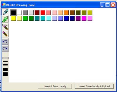
Please, don’ t make me use menus in my tablet applications.
One of the big revamps I did while dogfooding my blogging application was in the place where you can draw and change things like colors, pen width, ink or erase, etc I made everything available to just click on right on the screen. I got sick of the extra clicks. It’s really beautiful. Similar to what Paint does. (yes I’m still working out my stupid 24×24 icon problem…)

I did something similar in the doodling app on the web. Even if you can’t ink, you can see what I’m talking about here: www.thedatafarm.com/doodle.aspx.
![]() Sign up for my newsletter so you don't miss my conference & Pluralsight course announcements!
Sign up for my newsletter so you don't miss my conference & Pluralsight course announcements! ![]()